Ladbrokes
These posters for Ladbrokes were the only real press adverts I could find for any bookmakers recently, they have a strong and recognisable aesthetic with messages that try to entice customers into betting using ego-boosting suggestions.


The tone and aesthetic of the posters also matches that of the TV/Internet advert, which makes for a clear and coherent campaign.
The window advertising follows the same bold colour scheme as the posters, I feel like Ladbrokes print advertising successfully matches their TV campaigns and enticing customers.
Paddy Power
I also found this Paddy Power print campaign from 2002/2003 which uses inoffensive and somewhat slapstick humour to familiarise the audience with the technicalities of betting and to gain favour with the predominantly male audience.

However, the problem with this is that when it gets pushed too far it can cause complaints and bad publicity, the below examples show this.
It's easy to see how this sort of tone lead into the Oscar Pistorius poster below, which caused a lot of controversy at the time.
Whilst this doesn't give off the same sort of message William Hill want to get off, the tone of recent TV adverts has the same "laddish" and potentially offensive tone as the Pistorius advert and the more offensive 2002/2003 posters.
William Hill
William Hills advertising tends to promote considered betting, potentially turning the audience into a customer by sending them messages that they're in control. The below in-play TV adverts do this by rationalising the bet and making it appear sensible.
This concept is reflected in the main advert at the moment, although the aesthetic and tone is very different, instead it tries to attract customers through excitement.
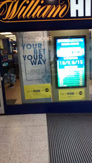
The printed material in the shop windows does neither, and feels very disjointed from the rest of the campaign, especially when it's compared to the relative success of Ladbrokes.

Betway, Betfair, Betfred and Coral
In my mind the strongest point of William Hill's campaign is their TV advert because of how it uses excitement to draw the attention of the audience and then pushes the message of control. This creates a much more individual tone than the adverts for online bookmakers Betway and Betfair which are very generic. The individualism and personality a physical bookmaker can provide that an online one can't is something that should be reflected in the print advertising.
When you compare the advertising in the windows of William Hill (above) to those of Betfed and Coral (below), they all look more or less the same, showing not only are William Hill missing out on creating and individual aesthetic, but their competitors are as well meaning that were William Hill to improve their shop windows, they'd stand out amongst bookmakers for it.

BetVictor
Like Betway and Betfair, BetVictor is a purely online bookmaker, but have a similar message to William Hill, but the differing aesthetics of William Hill and BetVictor will ensure that were William Hills shop windows made to match their campaign, there's no chance they'd be associated with any other bookmaker - BetVictor would've been the most likely candidate for this to happen becuase of their similar message of control.
Summary
Their are very few press adverts for bookmakers, and the ones that do exist tend to be very similar and have no personality or link to the main campaign of the bookmaker, with Ladbrokes arguably being an exception.
My suggetsions for improvement would be to change the print advertising in the shop windows to reflect the message, tone and aesthetic of the TV adverts, creating a more exciting and enticing display. Doing this would lift the moods of customers, making them more likely to spend more money.


No comments:
Post a Comment