Monday 23 May 2016

Module Evaluation

This year has been a big step forward in PPP for me. Whilst I’ve always understood what the module was trying to teach, I’ve often been stubborn about taking it on board in the past. Since Christmas I’ve really come on in this module because of the reality check I had when I approaching the end of the course. I know I could’ve done much more for PPP this year, but I feel like what I have done has been very important in terms of identifying a niche and preparing myself mentally for progressing beyond uni, which was a real struggle in the previous two years.

The niche I’ve identified is a design role somewhere within the sports industry, an area where I’m likely to be the target audience of any briefs. This is important as I’ve found that over the three years on the course, this I’ve enjoyed my work much more when working on briefs that I’m the target audience, and I find that my work benefits from this. Whilst I’m pleased with all the work I’ve done where I’m the target audience, I’ve sometimes questioned the quality of other bits of my work. Given that confidence in my work has been something I’ve struggled with at times, it seems senseless to me to undo the progress I’ve made in this area by trying to be something I’m not or do something I’m not comfortable doing such as working in a branding or web design studio for example.

Design for the sports industry generally serves three main purposes; selling merchandise, promoting a sport/event/competition, or information design for fans of the sport. The briefs I’ve been doing for extended practice fulfil these areas of design within the sport industry, but also show and ability to apply myself to things outside my comfort zone and my ability to come up with functional and creative solutions. When looking into job opportunities in this area I’ve struggled to find many opportunities, but my recent interview with William Hill where I narrowly missed out on the job has given my confidence that I’m more than capable of being employed in one of these roles, and I can compete with other applicants with more experience than myself.

Given the lack of opportunities for this area of design speculative applications are going to be important for me. Whilst this isn’t something I’ve started yet, it’s something that PPP has prepared me for - like previously mentioned, I’ve not done as much as I could’ve done for PPP this year, but the importance of the work I’ve started within PPP means that it will be continued after graduation up to the point where I start applying speculatively - I believe the promotional video produced in collaboration with Joe Shiels and Kit Cowey will be a big help with this, but the length of time taken for it’s production has delayed me starting this process. In the time between graduating and finding a job I will be continuing to work freelance with Harri Larkin and any other clients who end up coming my way - I have the appropriate resources for this all prepared (website, invoice slips etc), but I’d rather try and find work outside of the design industry whilst finding the right opportunity comes up for me rather than risk the enjoyment I’ve found in graphic design this year by working in an environment I’m not comfortable with.


In summary, PPP has been really valuable for me this year, as I feel like it’s helped me find my role within the design industry, albeit so slowly that I’ve not had much time to apply this knowledge towards the ILO’s as much as I’d have liked. This module has given me both confidence and much-needed direction within my work. So whatever the academic outcome my be for this module, it’s been invaluable to me on a personal level. 
Friday 20 May 2016

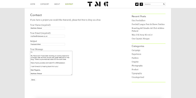
Contacting The Modern Game

Earlier today I messaged The Modern Game about potentially featuring the work Joe and I have done on their blog, this would be good exposure and an extra achievement to put on our CV's.


Monday 16 May 2016

Business Cards

Given I've recently re-designed my CV and Portfolio, I tweaked my business cards slightly to match them. The font sizes match, the line weight is the same as the line weight on my CV, and the logo is the same size as it is on my CV. The logo on the back is towards the bottom rather than placed centrally as it looks sturdier there, which helps reflect reliability.


Sunday 15 May 2016

William Hill Interview Preparation

I've been offered an interview with William Hill following my application. As part of the interview they'd like me to looks at their press advertising and that of their competitors to suggest how theirs could be improved.

Ladbrokes

These posters for Ladbrokes were the only real press adverts I could find for any bookmakers recently, they have a strong and recognisable aesthetic with messages that try to entice customers into betting using ego-boosting suggestions. 


The tone and aesthetic of the posters also matches that of the TV/Internet advert, which makes for a clear and coherent campaign.


The window advertising follows the same bold colour scheme as the posters, I feel like Ladbrokes print advertising successfully matches their TV campaigns and enticing customers.


Paddy Power

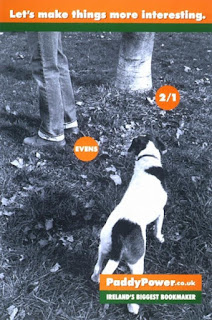
I also found this Paddy Power print campaign from 2002/2003 which uses inoffensive and somewhat slapstick humour to familiarise the audience with the technicalities of betting and to gain favour with the predominantly male audience.


However, the problem with this is that when it gets pushed too far it can cause complaints and bad publicity, the below examples show this.


It's easy to see how this sort of tone lead into the Oscar Pistorius poster below, which caused a lot of controversy at the time.


Whilst this doesn't give off the same sort of message William Hill want to get off, the tone of recent TV adverts has the same "laddish" and potentially offensive tone as the Pistorius advert and the more offensive 2002/2003 posters.


William Hill

William Hills advertising tends to promote considered betting, potentially turning the audience into a customer by sending them messages that they're in control. The below in-play TV adverts do this by rationalising the bet and making it appear sensible.  


This concept is reflected in the main advert at the moment, although the aesthetic and tone is very different, instead it tries to attract customers through excitement.


The printed material in the shop windows does neither, and feels very disjointed from the rest of the campaign, especially when it's compared to the relative success of Ladbrokes.


Betway, Betfair, Betfred and Coral

In my mind the strongest point of William Hill's campaign is their TV advert because of how it uses excitement to draw the attention of the audience and then pushes the message of control. This creates a much more individual tone than the adverts for online bookmakers Betway and Betfair which are very generic. The individualism and personality a physical bookmaker can provide that an online one can't is something that should be reflected in the print advertising. 


When you compare the advertising in the windows of William Hill (above) to those of Betfed and Coral (below), they all look more or less the same, showing not only are William Hill missing out on creating and individual aesthetic, but their competitors are as well meaning that were William Hill to improve their shop windows, they'd stand out amongst bookmakers for it.


BetVictor

Like Betway and Betfair, BetVictor is a purely online bookmaker, but have a similar message to William Hill, but the differing aesthetics of William Hill and BetVictor will ensure that were William Hills shop windows made to match their campaign, there's no chance they'd be associated with any other bookmaker - BetVictor would've been the most likely candidate for this to happen becuase of their similar message of control.


Summary

Their are very few press adverts for bookmakers, and the ones that do exist tend to be very similar and have no personality or link to the main campaign of the bookmaker, with Ladbrokes arguably being an exception.

My suggetsions for improvement would be to change the print advertising in the shop windows to reflect the message, tone and aesthetic of the TV adverts, creating a more exciting and enticing display. Doing this would lift the moods of customers, making them more likely to spend more money.

Tuesday 10 May 2016

Promotional Video Editing

The promotional video underwent some changes today, including the addition of the title and credit screens I designed which are shown below.


The updated video now looks like this after the changes were implemented.


The ending still feels a bit disjointed. It shows a clip of David Beckham while the commentary continues over a photograph of our work featuring a different player, with the credits screen sort of stuck on at the end.

After discussing this with Joe and Kit, we decided to remove the photograph of the weakest poster and replace it with the poster from the end and remove the David Beckham clip and commentary that plays over the credits screen. We'd replace this with a clip of an important goal from Leicester City's premier league recent title win with accompanying commentary, with the clip cutting out to the credit screen while the commentary continues. This simplifies the ending, keeps it in line with the rest of the video, and makes it a lot more current.

The end result is shown below, we're really pleased with it.

Job Applications

Having received generally positive feedback from the portfolio surgery yesterday I've started applying for some jobs I'd bookmarked over the past few weeks.

Midwight Designer via MET Marketing


Graphic Designer at RFE International via Brand Republic Jobs


Junior Press Designer at William Hill


Monday 9 May 2016

Things To Do In The Final 2 Weeks List

  1. Start applying for jobs
  2. Finish design boards for current work
  3. Prepare/update material required for freelance work
  4. Work more on extended practice making adjustments based on the feedback from the portfolio surgery earlier today

Portfolio Surgery With Something More

The feedback from Something More was really useful, to summarise:

Front Cover: It's normally better not to have a logo on the front of a portfolio, just put your name somewhere in the top corner.


Project 1 (Programme Covers): Strong project, swap the main photo and the left smaller photo, it doesn't matter that I've done more work on the back than on the front, the main draw of a programme is the front cover and working with other people is an important part of graphic design.


Project 2 (Panda Territory): Improve it and make it clearer by doing small branding touches for it - develop an icon and name for the game, set out some clear and simple brand guidelines, and show some of the app screens. Put this content in place of the two photographs.


Project 3 (Freya Williams): Seems a bit out of place when the other projects are based around animals or sport, whilst it shows an understanding of branding the alterations to the previous project will show this too. This project could be replaced with a sport-related project in order to focus the portfolio more.


Project 4 (European Championships): Similar aesthetic to project 1 because of collaboration. Either group the two projects together or extent this project more in the direction of the map posters where the illustration isn't as prominent to show I can work individually on football-related briefs. I'll do the latter.


Project 5 (WWF Condoms): Keep this as it is, it shows personality and a sense of humour and a good understanding of how to design for a specific audience.


Project 6 (Fish Transport Packaging): Interesting project, develop it further to show a range to make it more interesting, do some basic branding on it such as giving it a name and doing a logo. Photographing against black may not be the best way to go, try getting some photographs of it in use.


Back Cover: Fine, leave as is.


Conversation about Snooker Scores App Replacing Freya Williams project: Icon and name of the app etc, mock the screens up on a phone screen against a plain white background.

Actions to be taken from this feedback:

  1. Reomve logo from the front cover
  2. Remove Freya Williams brief from the portfolio
  3. Start working on basic branding for Panda Territory, Fish Bags, and Snooker Scores App
  4. Develop Euro 2016 project in a direction that takes it away from Football Programmes.

Friday 6 May 2016

Updated CV

Having taken the advice from my career coaching session on writing CV's I've updated mine, which now looks as shown below. I found this link which Ingrid suggested really useful.

Thursday 5 May 2016

Promotional Video Production

Having discussed with Joe how our video should run and what it should look like I sent the relevant photo's to Kit and sources appropriate video clips and music. We won't be using the video for commercial reasons so we don't need to worry about licenses. 

We chose clips of players who are featured in our work and of England players during famous moments, so viewers who may not be big football fans will still recognise some of the events.

The first edit of the video is shown below.


Matt & Joe Promo FIRST EDIT from Kit Cowey on Vimeo.


There were a couple of things Joe and I wanted tweaking, so after sitting down with Kit and discussing and agreeing the changes we gave him a list.


We also spoke about titles and what information is going to be included in them, agreeing that I'd design the titles and we'd include logos, websites and e-mail addresses for Joe, Kit and myself, specifying at the end that I did the designs, Joe did the illustrations, and Kit did the video, making it clear what our individual roles were.

Wednesday 4 May 2016

Web Presence

As a direct result of the feedback I got from this crit I have majorly updated my Behance Page which I'll be using as an online portfolio website. I also now have a holding page - www.mbrewer.co.uk - and a custom e-mail address - matthew@mbrewer.co.uk - to help me present myself as professionally as possible. The holding page was coded and the e-mail address set up by Jamie.

The holding page and e-mail address will be the information I give out to people, who can then easily visit my Behance page or this blog, depending on what they want to see.

Monday 2 May 2016

Updated Portfolio

After taking on board recent feedback from Square.One (here) and the decisions I made when thinking about my portfolio (here), it now looks like this: