Whilst I found Study Task 2 useful in terms of it helping me write about myself, working in a big Multi-Disciplinary studio isn't for me, I'd rather work part-time freelance or in-house at a large company. I'd had an eye on the Jaguar/Land Rover Graduate Program for a few weeks and thought I'd have a better chance of being successful in my application if I applied after completing Study Task 2.
The application required a portfolio and a CV, neither of which I had when I first came across the program. Over the last few weeks I've been developing the below files to submit with the application, which I submitted this morning.
Monday, 28 December 2015
Thursday, 17 December 2015
Harri Larkin - Passing Over Files and Discussion of Further Work
I was hoping do send Harri the files today, this would've been done through e-mail, but the some of the files I needed to send were so big it wasn't feasible. Instead I had to arrange for my friend to pick up a memory stick with them on to take back to Bristol with her after Christmas.


Having never been in a situation where I've been expected to send people files before, this is a problem I wasn't expecting to encounter, and is definitely something I'll be considering in the future when doing work for people.
Harri mentioned that they were planning to release and album around September time and they'd like to stay in touch with me for more work on that, which is promising.
Wednesday, 9 December 2015
Harri Larkin - Logo Development
After making some changes to the design to make them more suited to the band requirements I sent them some more screenshots of ideas. I knew they were having trouble deciding on colours, so I told them to focus on the actual design rather than the colours, at that's something which I can change easily at any point.
I'm waiting to hear back from the band before doing anything else.
More information about this stage of the project can be found here on my extended practice blog.
More information about this stage of the project can be found here on my extended practice blog.
Tuesday, 8 December 2015
Study Task 2 - Interview Practice
I am a creative, free-thinking, caring, productive, efficient, organised and resilient person who appreciates the solidity of routine but is creative enough to allow spontaneity to keep life exciting for myself. I’m a massive sports fan, football forms the backbone of my life through playing it, watching it, even down to discussing it in some of my social circles. I’m also a massive snooker fan and enjoy watching tennis and cricket. One of my slightly more obscure hobbies is aquarium-keeping, which I find relaxing against the stresses of life, as well as being enjoying the beauty of tropical fish.
My technical skills are sound. I’m very familiar with Photoshop, Illustrator and InDesign, having largely taught myself Photoshop through experimentation from around the age of 10 when the limitations of Microsoft Paint started frustrating me. My weaknesses in a technical aspect are my inability to use motion graphics software and lack of coding skills. However, having proved a quick learner of Illustrator and InDesign, I believe learning such skills wouldn’t be too difficult in the right surroundings given my general technical competence, persistence, and motivation.
I have varying experience in terms of work having worked with Square.One, a commercial design agency in Sheffield City centre, so I’m familiar with the industry, as well as having volunteered for a local Branch of Boys Brigade for 2 and a half years which is reflective of my caring nature. As well as this I also did a part time stint as an administrator in a Doctor’s surgery, a task where organisation and efficiency are of utmost importance. In terms of working with clients, I’ve worked on live briefs for clients including schools, bands, and film producers, so I have a fairly broad history in terms of working on cultural projects.
When working independently I tend to find my thought process works to it’s full potential such as in my dissertation and my WWF app proposal, as I’ve found that no two people think the same way, and so when thinking collaboratively certain things are inevitably overlooked. This is something which I find greatly irritating given my organised personality. That said, my ability to work in a team has been proven numerous times such as in my Duke of Edinburgh award, my extensive spell volunteering at Boys Brigade which was heavily reliant on the teamwork of the staff, the project proposal for Barbered Design, and the WWF Condom packaging.
My communication skills are generally very good. I find it easiest to express myself in writing, where I can properly structure and plan my thoughts into an eloquent message. I’m a very capable reader, as proven by my ability to write a dissertation around a subject as academic as philosophy, and know the importance of being able to listen to the opinions of others having grown frustrated at not having my thoughts taken seriously when I was younger. I occasionally struggle talking in front of large groups, but this is generally not an issue when I’m talking about something I’m knowledgable about or a design/product that I’m confident about.
In my opinion, graphic design is best summed up by the old ‘life is a box of chocolates’ metaphor. No two projects are the same, and naturally you’re drawn to the ones that you know you like, and are more apprehensive about newer ones, but that’s not going to stop you from trying them. The main difference between the box of chocolates of life and the box of chocolates of graphic design however, is that the latter will be much prettier.
Harri Larkin - Stickers Turning into a Logo
I received some photo's of the stickers from Harri, who thanked me for the time and effort I'd put into the stickers.
She also asked if I wouldn't mind spending a bit more time on the logo as she was more impressed with my ideas than the ones from the album artworker. In return she offered to send some money back for me with our mutual friend at Christmas. This was something I accepted straight away, as they're clearly pleased with my work and I thought it a good idea to establish a good working relationship with them as it could lead to further paid work in the future either with them or others from Bristol Institute of Modern Music.
She also asked if I wouldn't mind spending a bit more time on the logo as she was more impressed with my ideas than the ones from the album artworker. In return she offered to send some money back for me with our mutual friend at Christmas. This was something I accepted straight away, as they're clearly pleased with my work and I thought it a good idea to establish a good working relationship with them as it could lead to further paid work in the future either with them or others from Bristol Institute of Modern Music.
Thursday, 3 December 2015
Lack of Follow-Up by Simon Pickles - City Under the Floorboards
It's now been 10 days since I e-mailed Simon Pickles form City Under the Floorboards showing him my logo ideas. He replied saying he'd get back to me but he hasn't. It's been a bit of a disappointing experience in general.
The first time I contacted him it took him 2 weeks to get back to me, so I'm partially expecting the same thing to happen this time, however, the inconvenience this is causing me at such a busy time of year has caused me to decide that I no longer want to work on this project with him were he to eventually get back to me.
The first time I contacted him it took him 2 weeks to get back to me, so I'm partially expecting the same thing to happen this time, however, the inconvenience this is causing me at such a busy time of year has caused me to decide that I no longer want to work on this project with him were he to eventually get back to me.
Harri Larkin - Follow-Up Work
I rang my friend to tell her I'd had some ideas and asked if her housemate was available to talk about them. I sent the below screenshot to my friend and started talking to Harri, the lead singer of the band via text message.
Unfortunately by this point the person who's doing the artwork for the band's first album had offered to do a logo as well, but Harri liked these a lot and asked if she could use them as stickers, and potentially as the logo if she and the band liked them more than the other proposed logo.
I set up the ideas they wanted to use for stickers in the way for them with bleed and crop marks as this website asked as Harri wasn't comfortable doing it herself.
This project didn't take me too long, and because it was for other students I wasn't bothered about asking for any payment, especially as it opens the door for more potential work with them in the future if they get bigger, but this might be something I re-assess if they want to use it as the logo rather than just for stickers.
There was some confusion caused on their end by them forgetting the difference between a diameter and a radius, which lead to me having to spend about 20 minutes longer working than I would've otherwise had to do, but this is really a minor issue at most, and, on the whole, it's been another positive experience working with friends as was the case with Jamie, Beth, and Barbered Design last year.
More information about this stage of the project can be found here on my extended practice blog.
Wednesday, 2 December 2015
Curated by... Domenic Lippa - Sheffield Hallam University
Today there was a talk at Sheffield Hallam University that I wanted to go too and had a ticket for, but was unable to attend for health reasons, as I thought it better not to go at all than to risk falling asleep during it.
I wanted to go for a couple of reasons:

I wanted to go for a couple of reasons:
- Domenic Lippa's background involves packaging and retail graphics, areas of design which I can see myself going into more than others, so it'd have been interesting to here what he was going to have to say.
- In my dissertation I cite Michael Bierut a lot, who also works at Pentagram. It'd have been good first hand research for CoP and interesting to see if there were any parallels between the mindsets of the two of them.

Monday, 30 November 2015
Harri Larkin - Initial Conversations
I got a phone call earlier from a friend asking if I could mock up some logo ideas that her friend had had for their bands logo. The band is called Harri Larkin and is based in Bristol.
The description I received was that they wanted a chess piece as the symbol, and the text to say either the full band name or just the letters HL. I chose a knight as the piece to use because it's arguably the most illustrative of all the chess pieces and is asymmetrical, which makes it more of a symbol and less of a badge.
Whilst it followed their instructions it ended up looking very corporate and clearly wasn't suitable for a band at all, especially given that they really like The Ramones logo and wanted to use it as an influence, something they told me afterwards.
It was a bit frustrating that their guidance led in the complete opposite direction to where they actually wanted to go, so I told them to leave it with me a couple of days and I'd send them something back that was more suitable.
More information about this stage of the live brief can be found here extended practice blog.
The description I received was that they wanted a chess piece as the symbol, and the text to say either the full band name or just the letters HL. I chose a knight as the piece to use because it's arguably the most illustrative of all the chess pieces and is asymmetrical, which makes it more of a symbol and less of a badge.
Whilst it followed their instructions it ended up looking very corporate and clearly wasn't suitable for a band at all, especially given that they really like The Ramones logo and wanted to use it as an influence, something they told me afterwards.
More information about this stage of the live brief can be found here extended practice blog.
Friday, 27 November 2015
LinkedIn Job Notifications
I recently discovered at William Hill that seems like a good fit for me from an e-mail sent from LinkedIn, so it's worth paying attention to these e-mails.


Wednesday, 25 November 2015
Masters Courses
I've recently been looking at Masters courses that interest me for future reference. Whilst I don't want to go straight onto one after graduating, it's something I would consider 2 or 3 years after graduating after taking a break from education, which I'm growing a bit wearisome of.
I'd want to stay in Yorkshire. Having lived in Sheffield all my life until moving to Leeds for University, I've grown comfortable in Yorkshire. I find that when I've visited other cities there tends to be a different feel about them to ones in Yorkshire. I particularly like York.
I enjoy working on projects designed for human interaction, be they digital UX design, physical packaging, or augmented advertising and marketing. With this and location in mind I found some courses that I'd be interested in looking into further:
University of York - Social Media and Interactive Technologies
York St John University - Design
University of Leeds - Advertising and Design
University of Sheffield - Marketing Management Practice
I'd like to spend a bit more time in York before going to an open day to see if I could envisage myself living there, as it's been a while since I've been. Hopefully this can intertwine with my City Under The Floorboards brief for Extended Practice.
Research Journals
Having put a lot of time and effort into my dissertation and having received very positive feedback from my dissertation tutor, I've been looking into potentially getting my dissertation published in a research journal.
Two I'm looking at in particular are Critical Commentary, a journal promoted within university, and JAWS, a journal recommended to me by my dissertation tutor. At this moment in time I prefer the latter as Critical Commentary doesn't allow articles over 7,000 words and wants to retain copyright of all submissions, which would mean I'd have to shorten my dissertation and have less freedom to use it in future should I need too.
Two I'm looking at in particular are Critical Commentary, a journal promoted within university, and JAWS, a journal recommended to me by my dissertation tutor. At this moment in time I prefer the latter as Critical Commentary doesn't allow articles over 7,000 words and wants to retain copyright of all submissions, which would mean I'd have to shorten my dissertation and have less freedom to use it in future should I need too.
Tuesday, 24 November 2015
Help With Textiles Student's Design
A student on Printed Textiles recently asked me to make them a candy cane for use in one of her designs she wanted to enter in a competition because she wasn't confident doing it herself.
She offered me half of the prize, which I turned down as the student is a close friend, and I deemed it unnecessary as it didn't take me very long, she insisted on some form of payment though, so we agreed on 25% of any winnings from the competition.
I asked her to specify what size she wanted it and if she wanted any highlights or shadows etc to make the process as quickly as possible, this was the result.

These are the final designs where it's been used:


Saturday, 21 November 2015
Joining LinkedIn
This morning I joined LinkedIn, I feel like it's necessary now, as I've started talking to people more and am more actively looking for live briefs, something that I haven't been doing until now.
I've filled out the majority of the information required to give as complete a profile as possible, although I'm yet to find a suitable photo for my profile picture.
I've requested to join groups relating to my interests, inculding Tropical Fish and Snooker.
Friday, 20 November 2015
Alteration to Self-Promotion Logo
I wanted to review my self-promotion logo from last year to check it was still appropriate for my work this year.

I wanted to make it more reflective of my personal interests, which is what my work focusses on to a large extent this year, so I tried incorporating the shape of the tail of an angelfish into the logo, as fish-keeping is one of my main interests.

I wanted to see how the shape looked by itself, but it's just too bulky when filled with a solid colour and loses it's elegance, as well as looking like a moustache.

I instead tried change the shape of the B to the tail shape, but I found that the curves contrasted with the points in the M making it look a bit confused. I was also told that the B looked very reminiscent of a pair of breasts, which isn't appropriate at all.

Getting rid of the points using the same shape made it look a bit like the McDonald's logo, and it was far too open.

I went back to the previous stage and added an extension to the fish tail, but I didn't like how this made it less square and made the B less obvious.

Given that my logo will be placed on business cards that very in shape to represent the projects in my portfolio it's probably not a big issue that adding the fish shape to the logo doesn't work.
Some of the feedback I got last year was that the B looked like an R, by putting my name underneath the symbol this was no longer an issue, but it limits the flexibility of the symbol if the text should always be placed underneath it.

I found that by extending the line of the B slightly this was no longer a problem, so the logo for my self-promotion will remain largely unchanged from last year, it's simple and gimmick-free like my work and personality.

When I start getting a better idea of what projects I'll be including in my portfolio I'll start working on the designs for the business cards, which will then lead in to some form of website. This shouldn't be too far away now though, as my extended practice is running smoothly.
Conversation with Simon Pickles at the University of York
Simon got back to me yesterday from the University of York about the doing some design work for the film City Under The Floorboards, he apologised for the amount of time it'd took and said that he'd like to work with me.

He said that he needed a logo and social media presence doing fairly quickly, with promotion and merchandising at a time that suits me at a later date. The policy of the university means that they're not allowed to pay me, but this isn't an issue for me because the project shouldn't be too time-consuming, as well as potentially providing me with opportunities to work in York in the future, which would be great because I love the city.
I replied, but I made clear that it's a slightly inconvenient time at the moment because of the timing clashing with my dissertation hand-ins and tutorials, which are my priority at the moment.

Saturday, 7 November 2015
Assessing Competition Briefs
The competitions that I considered entering have now all released their briefs, these were YCN, D&AD, RSA, and Starpack.
I had initially hoped for a packaging brief, so Starpack were the ones I was most looking forward too, however, I found them to all be a bit obscure apart from the Nestle one, which had the opposite problem and was too vague.
The D&AD briefs all seemed either very campaign-based or a bit dull, so none of them really caught my attention, the RSA briefs tended to have the same problem.
YCN were a lot more varied, and I found that The Saucy Fish Co. brief had a good balance of commercialism with fun, and freedom with restriction.
On top of The Saucy Fish Co. brief, I'm also planning on doing the A Clockwork Orange Brief from the Penguin Design Awards. I recently watch this film to try and gain a practical understanding of existentialism for my CoP essay.
Friday, 6 November 2015
Help With Poster For 'Travelling Man Presents BA Hons Illustration Party'
Joe Shiels asked me to help him with a poster to fill a gap at an exhibition he's helping to curate, 'Travelling Man Presents BA Hons Illustration Party'.
The exhibition is heavily illustrative, and so the poster needed to not overshadow any of the illustrations, so Joe requested it be type only and stuck to the colour scheme of the exhibition.
This is what we came up with:

The exhibition is heavily illustrative, and so the poster needed to not overshadow any of the illustrations, so Joe requested it be type only and stuck to the colour scheme of the exhibition.
This is what we came up with:

Wednesday, 4 November 2015
Edenspiekermann and MetaDesign
Edenspiekermann and MetaDesign are design agencies heavily influenced by Erik Spiekermann, one of the most well-known and successful signatories of the 2000 First Things First Manifesto.
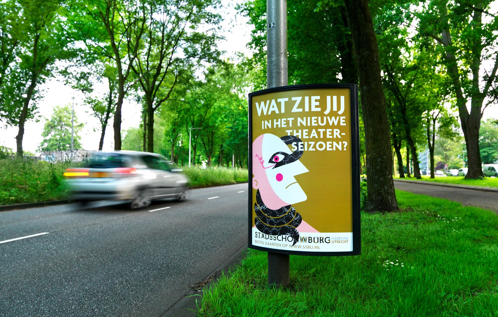
The below images are work done by offices of Edenspiekermann in Berlin, Singapore, and Amesterdam for Optivo, The City of Amsterdam, and Utrecht City Theatre respectively. Their similar aesthetics despite their different head designers are examples of how modernist design tends to look very similar and easily replicated.
Eddie Pillers description summary of a modernist lifestyle is “an aphorism for clean living under difficult circumstances”, which, if extended into Graphic Design would suggest that Edenspeikermann have allowed, to some extend, modernist principles to become more important that result of following the principles.
If this is the case then you would expect Spiekermann himself to be very committed to the other principles of the 2000 First Things First Manifesto, such as the opposition of commercialist culture. Despite this, MetaDesign, a company founded by Spiekermann himself, have clients including Bosch, Volkswagen, Raiffeisen, Audi, Karcher, Coca-Cola, Siemens, and Lacoste.
This is a practical example of how First Things First's ideology is nothing more than an ideology, it's impossible to work in practice because of how capitalism works, which is undermining of the anti-capitalist message set by the 2000 First Things First Manifesto.
Optivo (Link)


City of Amsterdam (Link)


Utrecht City Theatre (Link)


Sources
http://www.edenspiekermann.com/
http://sanfrancisco.metadesign.com/
https://vimeo.com/52431977
Monday, 2 November 2015
Contacting Simon Pickles at the University of York
I received an e-mail earlier about a potential live brief that I could work on in place of the DOPA Solutions Parkinsons Pen.


It's something that fits with the work I'm doing this year quite well, and something I'm interested in doing, so I e-mailed Simon expressing my interest in the project.

I hope to hear back soon.
Thursday, 29 October 2015
Contacting DOPA Solution
I recently e-mailed DOPA Solution asking if I could help them with the marketing and distribution of their product, a pen which makes it easier for people with Parkinson's disease. Unfortunately they never got back to me, and I've since found that their project has been indefinitely discontinued, which is a shame. My e-mail read:
Hi,
I am a final year Graphic Design student at Leeds College of Art, I found your project on the internet and wondered if there was anything I could do to help any marketing or distribution of the pen, whoever big or small.
My grandfather suffered heavily with Parkinson's for the final few years of his life, I spent a lot of time caring for him before I moved away to university, so it's a subject that is important to me and one which I have experience with.
Regardless of whether my help is wanted/needed or not with regards to graphic design, my grandmother is still involved with a community of Parkinson's carers on the outskirts of Sheffield, and if there's anything I could do to help through this, please let me know.
Thanks for your time, and I hope your good work continues,
Matthew Brewer
Monday, 26 October 2015
Work for Square.One

I recently went and worked with Square.One, a design agency in Sheffield, on a live project to re-design Royd Nursery Infant School's logo. The logo had to be red, blue and white, and be representative of the following qualities:
- Including Everyone
- Hardworking
- Thoughtful
- Sharing
- Supportive
- Kindness
I was also given this pack of documents that SquareOne had produced for schools and nurseries previously to use for inspiration and ideas.
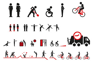
After speaking with Michael (the Senior Designer) and Jonathan (Director) we agreed that my initial ideas weren't really suitable for a school where the pupils were so young as they were more symbolic than pictorial as shown below.

The idea behind these was that the hands and triangles were placed in a structured way to support each other, with the hands being representative of sharing and kindness and the triangles reinforcing the supportiveness. The circle around them is to try and represent inclusiveness, these are made from ribbons and triangles to try and reflect happiness and supportiveness respectively.
I then tried to think a bit more pictorially and ended up with these, but I they thought they were a bit cliche and simple and wanted to avoid using them.

My next set of ideas were much more appropriate. I took forward the idea of using ribbons and the circle shape to make a crest. I then worked on the idea of using the ribbons to form a letter R as well as to try and represent a maypole, something which requires all of the above qualities.

After discussing these ideas we decided that I should run with the maypole idea as it sums up everything the school was looking for and is appropriate as the school happens to have a maypole, but the shape should become a bit more abstract and extravagant.

We found these to be a bit too abstract, which was the problem I initially had with the triangles and the hands. After adding in the children and the pole it became a lot clearer what the image was, and that the lighter tones of red and blue made the logo feel more positive.
The final logo looks like this.

I also adapted it to work in greyscale and monotone

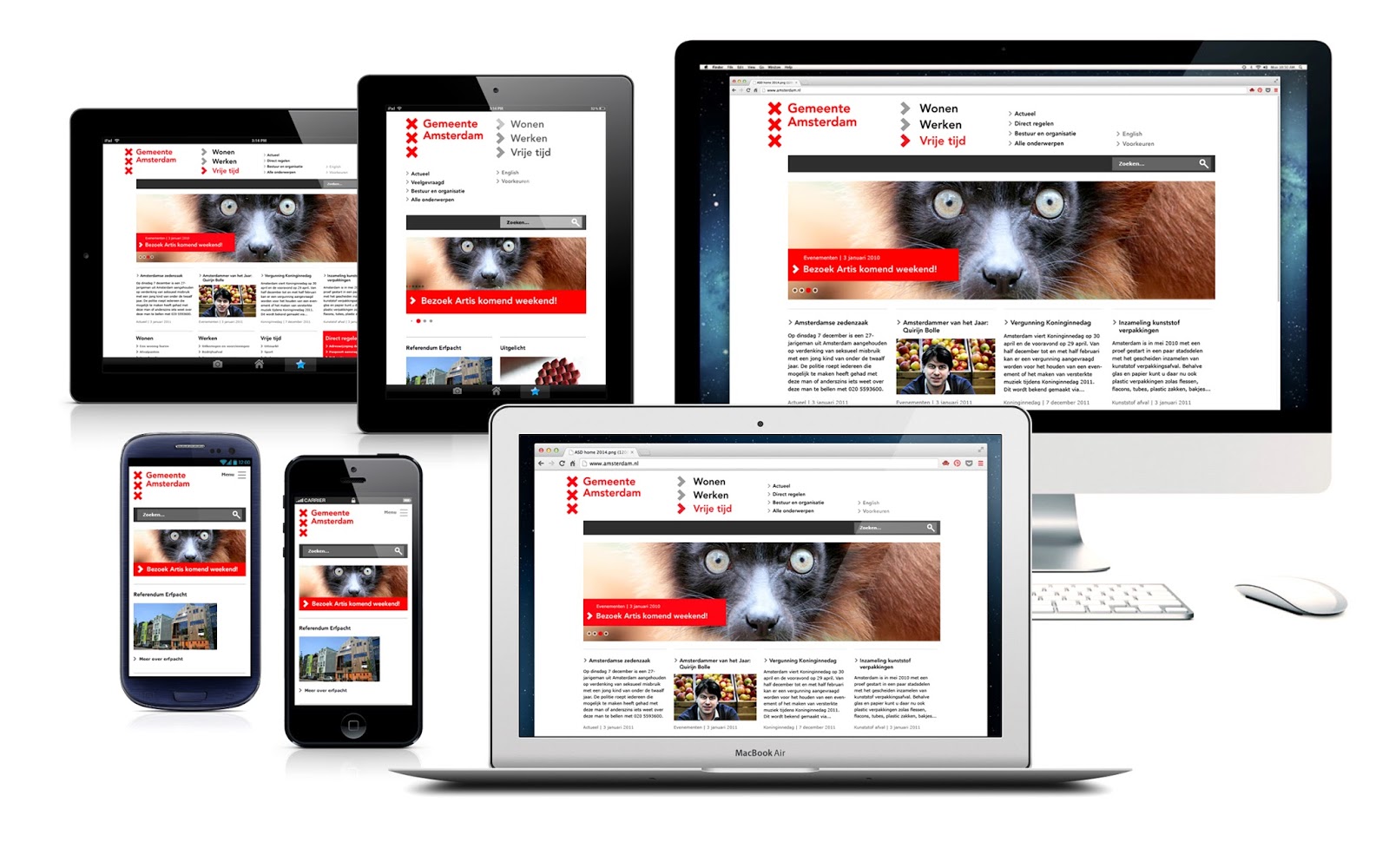
I then adapted these into uniform, a stationary set including letterheads, business cards and compliment slips, and a mock up what their new website could look like with the new logo.


This project took just over a week in total, which I thought was pretty reasonable given how slowly ideas came to me despite knowing that I'd be doing this brief a few weeks in advance of starting it. This was something I discussed with Michael, who reassured me that it's not something I should worry about.
I found the experience as a whole pretty enjoyable despite how slow it was in parts due to my lack of ideas, and was pleased with the outcomes I produced.

The idea behind these was that the hands and triangles were placed in a structured way to support each other, with the hands being representative of sharing and kindness and the triangles reinforcing the supportiveness. The circle around them is to try and represent inclusiveness, these are made from ribbons and triangles to try and reflect happiness and supportiveness respectively.
I then tried to think a bit more pictorially and ended up with these, but I they thought they were a bit cliche and simple and wanted to avoid using them.

My next set of ideas were much more appropriate. I took forward the idea of using ribbons and the circle shape to make a crest. I then worked on the idea of using the ribbons to form a letter R as well as to try and represent a maypole, something which requires all of the above qualities.

After discussing these ideas we decided that I should run with the maypole idea as it sums up everything the school was looking for and is appropriate as the school happens to have a maypole, but the shape should become a bit more abstract and extravagant.

We found these to be a bit too abstract, which was the problem I initially had with the triangles and the hands. After adding in the children and the pole it became a lot clearer what the image was, and that the lighter tones of red and blue made the logo feel more positive.
The final logo looks like this.

I also adapted it to work in greyscale and monotone

I then adapted these into uniform, a stationary set including letterheads, business cards and compliment slips, and a mock up what their new website could look like with the new logo.

This project took just over a week in total, which I thought was pretty reasonable given how slowly ideas came to me despite knowing that I'd be doing this brief a few weeks in advance of starting it. This was something I discussed with Michael, who reassured me that it's not something I should worry about.
I found the experience as a whole pretty enjoyable despite how slow it was in parts due to my lack of ideas, and was pleased with the outcomes I produced.
Subscribe to:
Posts (Atom)